Sportlycée
Customer

Services
GRAPHIC DESIGN
-
Logo Design
-
Branding
Involved


For the Sportlycée Luxembourg, we developed a modern and dynamic logo redesign based on the school’s existing visual identity. The new logo offers a contemporary interpretation of the school’s sporting character and institutional identity, sharpening its visual presence.
The central design element of the logo consists of four stylized speed stripes, which can also be interpreted as a symbolic representation of a four-lane running track. Positioned to the left of the wordmark, the stripes form a balanced logo composition that visually conveys competitive spirit, forward momentum, and speed.
The color palette of the stripes is deliberately inspired by the Olympic colors, emphasizing the school’s international orientation and its high athletic standards. The typography of the wordmark was replaced with a clear, linear typeface that communicates dynamism and determination without compromising legibility or professionalism.
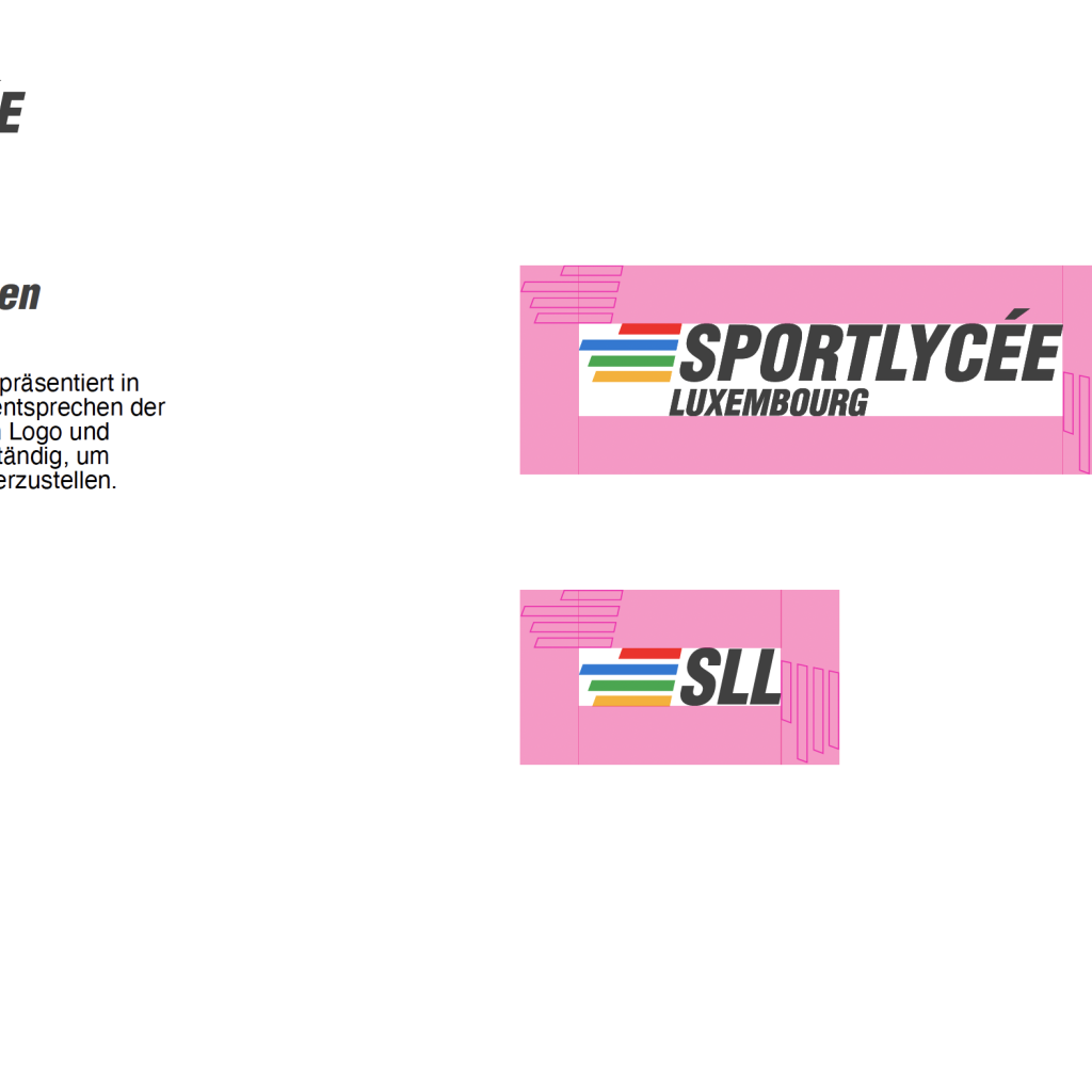
The new logo was developed in two color variants – for light and dark backgrounds – and documented in a compact style guide. This guide defines the typography, color specifications, usage examples, and safety zones, ensuring consistent application across print and digital media.
Are you planning a digital project or would you like to advance your business digitally? Then we should get to know each other.


