- WEB DESIGN:
Conception, Consultation, Responsive Web Design, Frontend Development, Backend Development, UX/UI Design
- Customer:
Commune de Mamer
- Sub Title:
Digitales Einschreibesystem & Veranstaltungsportal
- Main Service:
WEB DESIGN
- Customer URL:
https://activites.mamer.lu/
- Customer Logo:
- Involved:
- Name:
Marc , Function:
Project Lead , Portrait:

- Name:
Francis , Function:
Developer , Portrait:

- Key Features:
- Title:
Dynamesch Iwwersiicht , Description:
D’Iwwersiicht vun de Manifestatiounen bitt eng intuitiv benotzbar Filterfunktioun, déi et de Benotzer:innen erméiglecht, d’villfälteg Offeren vun der Gemeng geziilt no Schlësselwierder oder vordefinéierte Kategorien ze duerchsichen. , Image:
- Title:
Digitalt Aschreiwungssystem , Description:
E integréiert, benotzerfrëndlecht Aschreiwungssystem erméiglecht d’direkt Umeldung zu Manifestatiounen – iwwersiichtlech, effizient an an Echtzäit mam aktuelle Buchungsstatus verlinkt. , Image:
- Title:
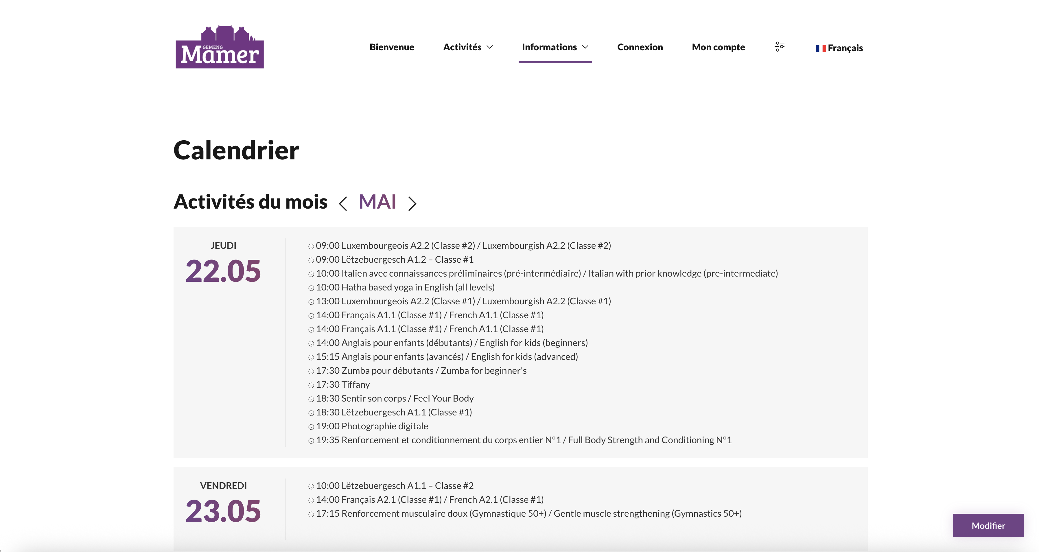
Manifestatiounskalenner , Description:
De zentral verwaltete Manifestatiounskalenner gëtt redaktionell vun der Gemeng gefleegt a faasst all Rendez-vousen, Vakanzenzäiten an Aktivitéiten an enger strukturéierter, digital ofruffbarer Iwwersiicht zesummen. , Image:
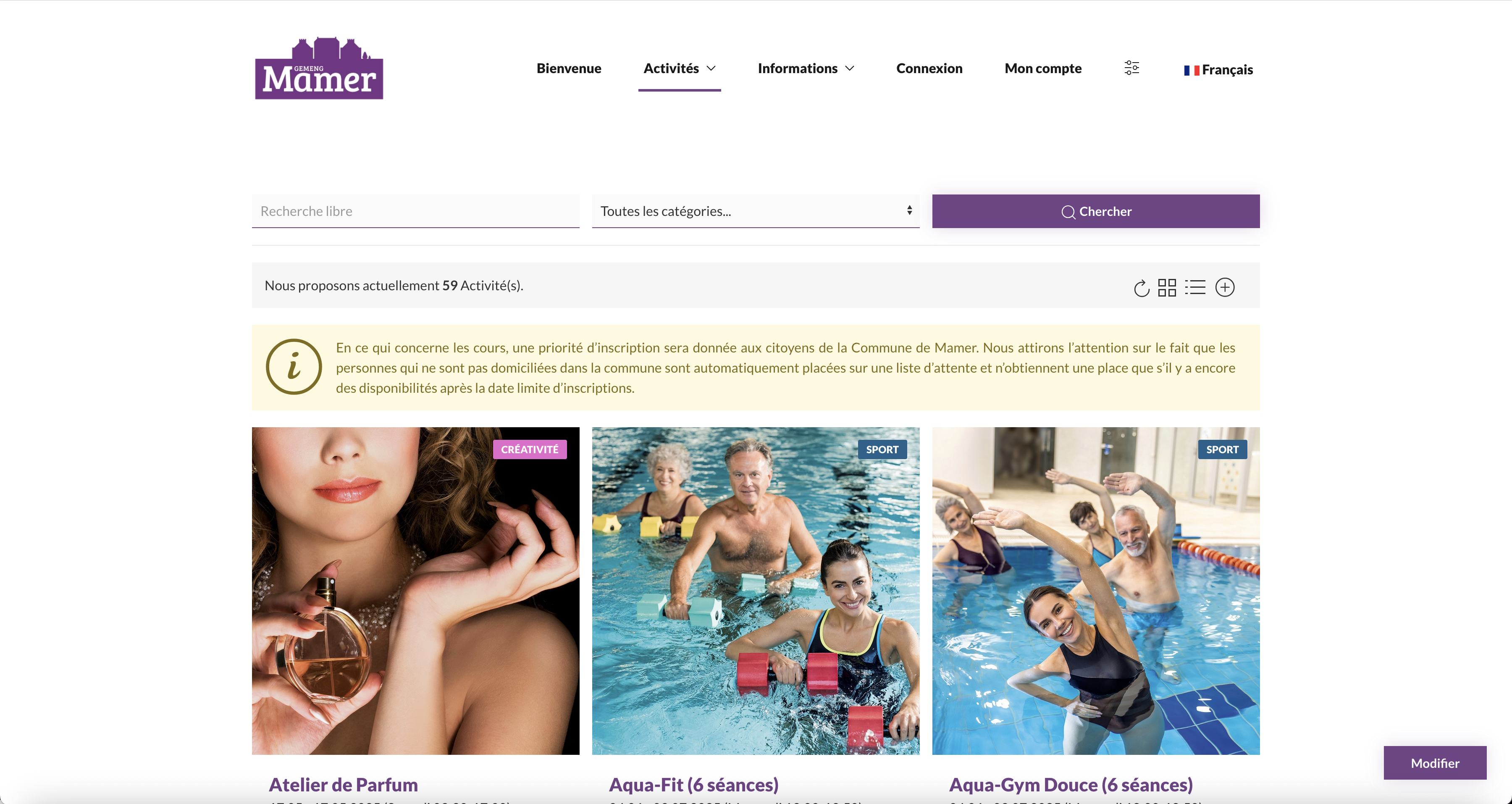
Fir d’Commune de Mamer gouf eng op Mooss entwéckelt Online-Plattform fir d’Aschreiwung an gemeendebezunnen Aktivitéiten a Veranstaltungen realiséiert. D’Zil vum Projet war et, eng zentral an einfach zougänglech Plattform fir Bierger:innen aus Mamer, Capellen a Holzem ze schafen – souwuel fir d’Informatioun wéi och fir d’direkt Umeldung.
Am Mëttelpunkt vun der Uwendung steet eng iwwersiichtlech Veranstaltungsdatenbank mat integréierter Filterfunktioun, déi eng fräi Textsich souwéi eng Auswiel no vordefinéierte Kategorien erméiglecht. All Inhalter si sou strukturéiert, dass d’Notzer:innen mat wéinege Klicks déi fir si relevant Offere fannen – vu Sport- a Kulturveranstaltungen iwwer Vakanzaktivitéiten bis hin zu Informatiounsowenter.
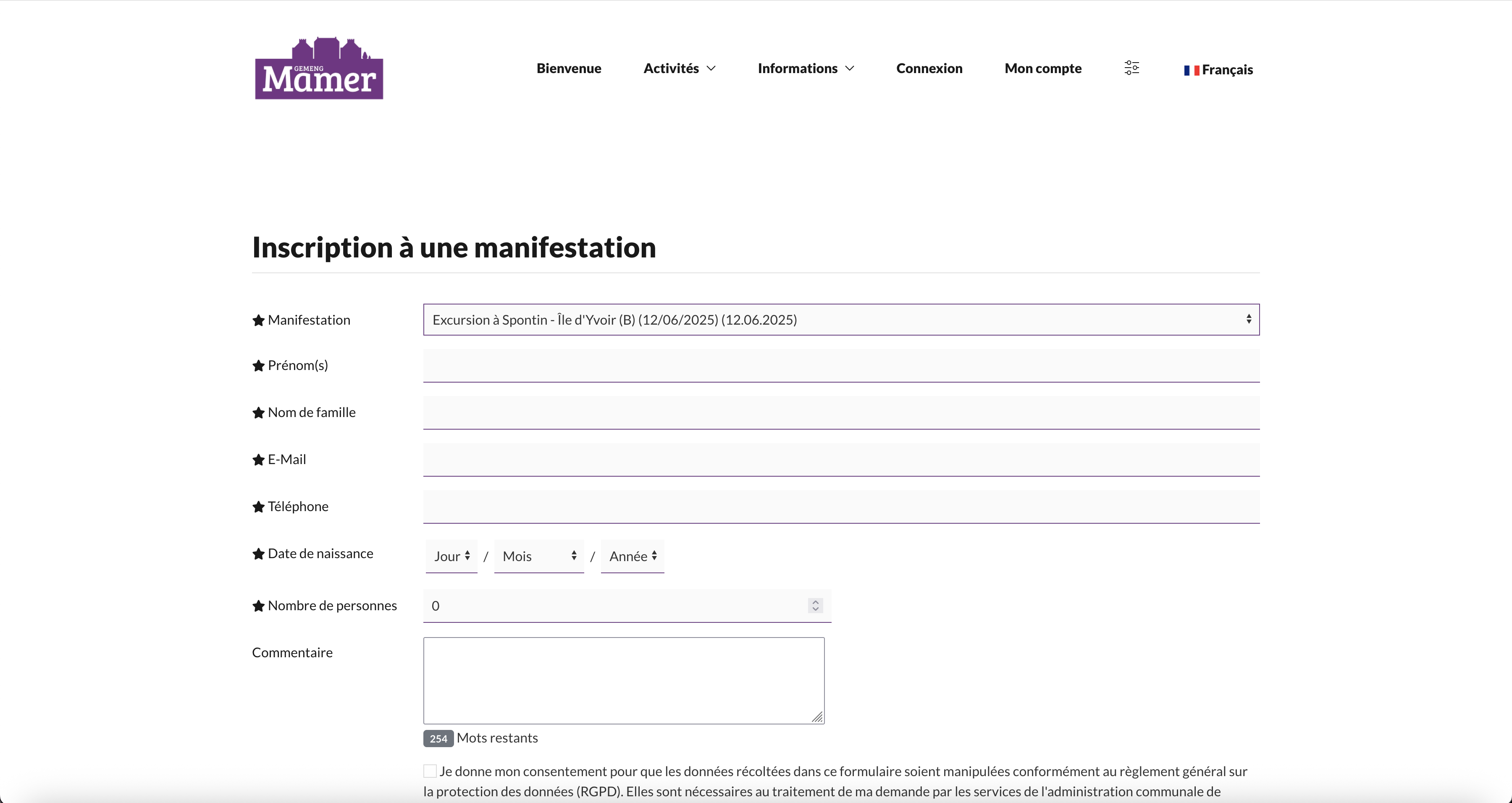
All Veranstaltung huet eng eegen Detailssäit, op där all wichteg Informatiounen wéi Datum, Auerzäit, Plaz, Participatiounsfraise an Umeldeméiglechkeeten kompakt a kloer opgelëscht sinn. An der Reegel fënnt d’Aschreiwung direkt am System iwwer e Formulaire statt; just a spezielle Fäll gëtt op extern Umeldungssäite verwisen.
Ergänzend zur Veranstaltungsiwwersiicht gouf en ëmfaassenden Informatiounsberäich entwéckelt, deen zentral Inhalter wéi wichteg Kontaktadressen, dacks gestallte Froen (FAQ) souwéi Pläng vun der Gemeng a senge Sektiounen zesummeféiert. Dëse Beräich déngt als digitalen Serviceberäich fir Bierger:innen a ënnerstëtzt d’Verwaltungsaarbecht vun de Gemengestrukturen.
En anert wichtegt Element ass de integréierte Veranstaltungskalenner, deen vun der Gemengeverwaltung gefleegt gëtt an lafend Aktivitéiten, Schoulvakanzen a widderhuelend Rendez-vousen duerstellt. D’Datepflege geschitt iwwer en internt Redaktiounssystem, dat de Mataarbechter:innen eng effizient a strukturéiert Gestioun erméiglecht.
- WEB DESIGN:
Conception, Consultation, Responsive Web Design, Frontend Development, Backend Development, UX/UI Design
- Customer:
Commune of Mamer
- Sub Title:
Digital Registration System & Event Portal
- Main Service:
WEB DESIGN
- Customer URL:
https://activites.mamer.lu/
- Customer Logo:
- Involved:
- Name:
Francis , Function:
Developer , Portrait:
- Name:
Marc , Function:
Project Lead , Portrait:
- Key Features:
- Title:
Dynamic Overview , Description:
The event overview offers an intuitive filtering function that allows users to search the municipality’s diverse offerings by keywords or predefined categories. , Image:
- Title:
Digital Registration System , Description:
An integrated, user-friendly registration system enables direct sign-up for events – clearly structured, efficient, and linked in real time to the current booking status. , Image:
- Title:
Event Calendar , Description:
The centrally managed event calendar is editorially maintained by the Commune de Mamer and compiles all appointments, holiday periods, and activities into a structured, digitally accessible overview. , Image:
A custom-built online platform has been developed for the Commune of Mamer to facilitate registration for municipal activities and local events. The goal of the project was to create a centralized and easily accessible digital space for residents of Mamer, Capellen, and Holzem – serving both as an information hub and a direct registration tool.
At the heart of the application is a clearly structured event database with an integrated filtering function. Users can perform free-text searches or browse through predefined categories. All content is organized to ensure that residents can find relevant offerings with just a few clicks – from sports and cultural events to holiday activities and informational evenings.
Each event features a dedicated detail page listing all essential information such as date, time, location, participation fees, and registration options in a clear and concise format. In most cases, registration takes place directly within the system via a form; only in special cases is an external registration page linked.
In addition to the event overview, a comprehensive information section has been developed. It consolidates key content such as important contact addresses, frequently asked questions (FAQs), and municipal maps of the Commune of Mamer and its districts. This section serves as a digital citizen service area and supports the administrative work of the municipal structures.
Another key feature is the integrated event calendar, maintained by the municipal administration. It displays ongoing activities, school holidays, and recurring appointments. Data management is handled via an internal editorial system, enabling staff to manage content efficiently and in a structured manner.
- WEB DESIGN:
Conception, Consultation, Responsive Web Design, Frontend Development, Content Creation, UX/UI Design
- GRAPHIC DESIGN:
UX/UI Design, Icon Design, Illustration, Consultation, Conception
- Customer:
Lycée Technique pour Professions Éducatives et Sociales
- Sub Title:
Redesign Website
- Main Service:
WEB DESIGN
- Customer URL:
https://ltpes.lu/de/
- Customer Logo:

- Involved:
- Name:
Marc Burelbach , Function:
Project Lead , Portrait:
- Name:
Francis Manderscheid , Function:
Developer , Portrait:

- Name:
Jakob Bolay , Function:
Designer , Portrait:

- Key Features:
- Title:
Notzerzentréiert Informatiounsarchitektur , Description:
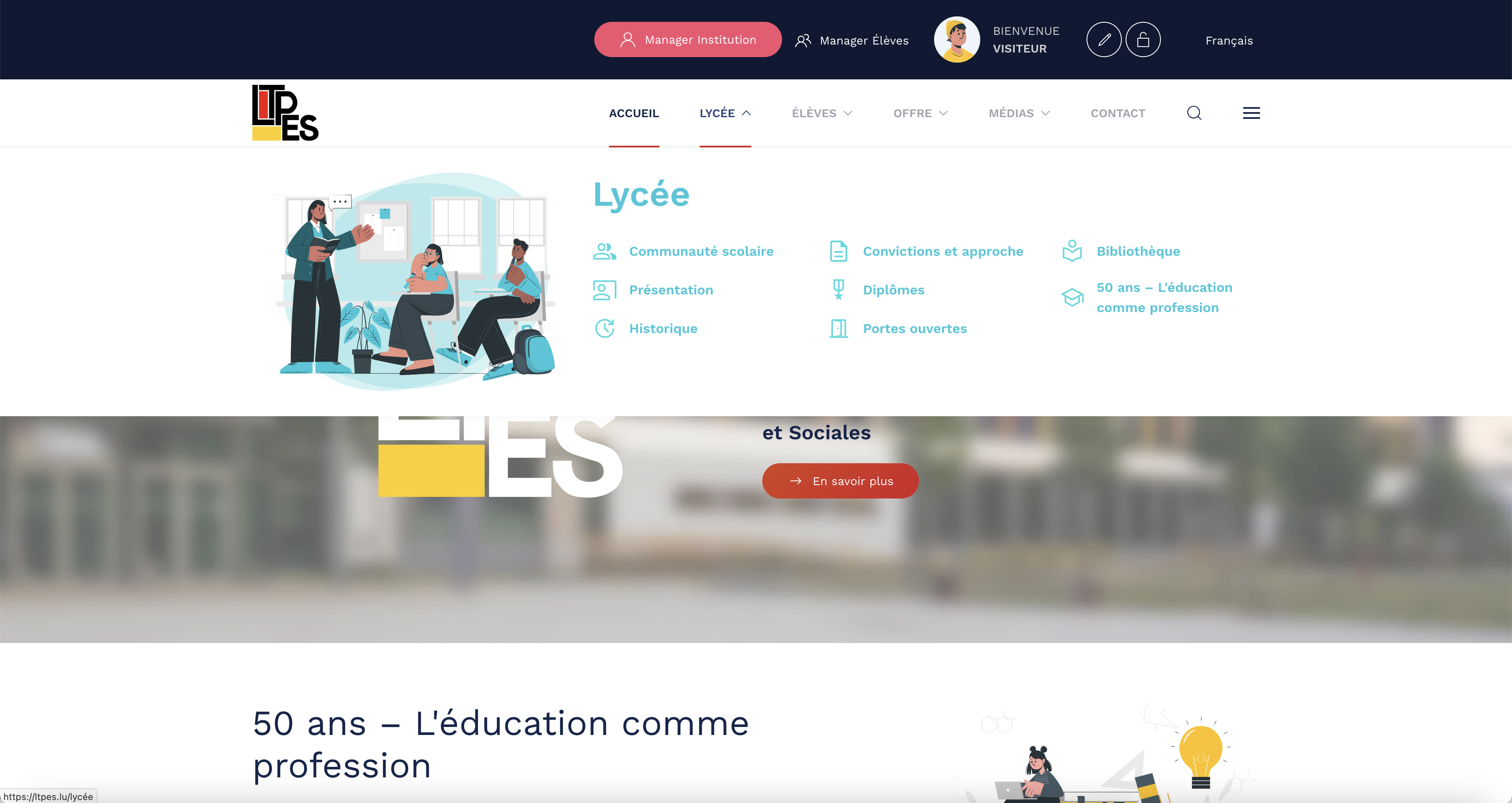
D’nei strukturéiert Informatiounsarchitektur gouf an Zesummenaarbecht mat der Schoul entwéckelt a suergt dofir, dass och komplex Inhalter fir Schüler:innen, Elteren a Léierpersonal séier ze fannen an einfach zougänglech sinn. , Image:
- Title:
Digitalt Voreinschreiwungssystem , Description:
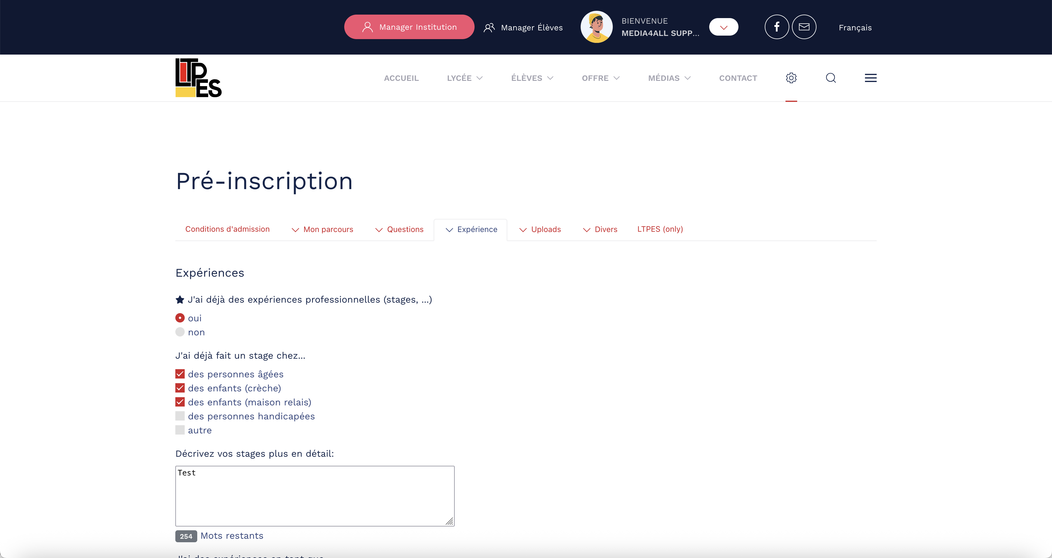
E datenbankgestützt Aschreiwungsformulaire erméiglecht zukünftege Schüler:innen eng unkomplizéiert Voreinschreiwung fir déi nächst Schouljoer – vollstänneg integréierbar an d’intern Verwaltungsstruktur vun der Schoul. , Image:
- Title:
Redaktionell fleegbar Inhalter , Description:
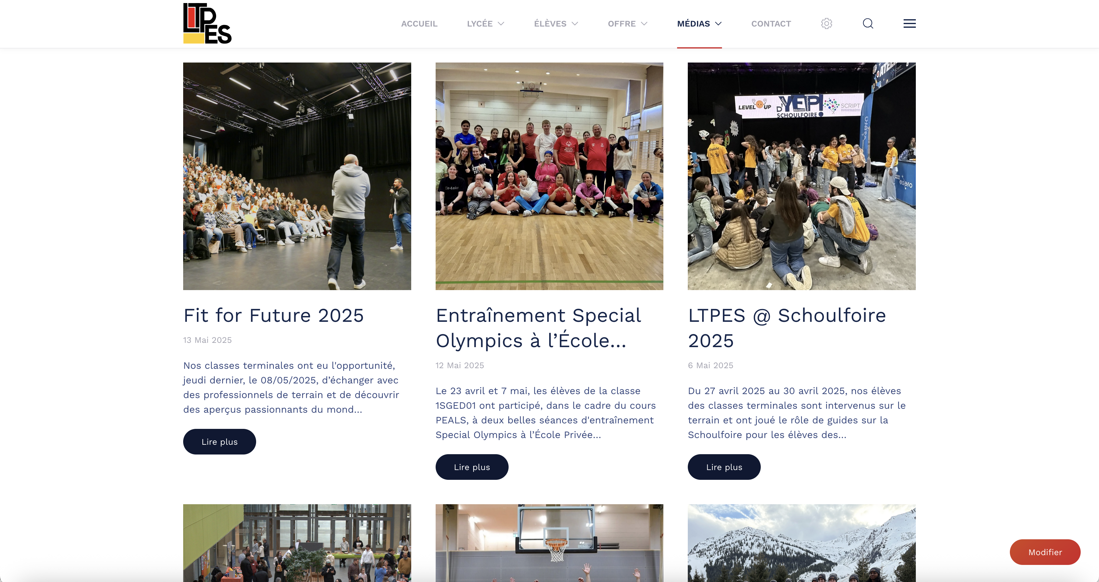
D’Websäit gouf op Däitsch, Franséisch an op Lëtzebuergesch ëmgesat a bitt mat engem flexible Newsberäich redaktionelle Spillraum fir aktuell Inhalter – direkt vum Schoulteam ze fleegen. , Image:
Am Kader vun enger ëmfaassender Neigestaltung vun der Websäit vum Lycée Technique pour Professions Éducatives et Sociales (LTPES) gouf eng modular, méi sproocheg Plattform entwéckelt, déi als zentral Informatiouns- a Serviceportal fir Schüler:innen, Elteren an d’Schoulëmfeld déngt. D’Zil vum Relaunch war et, déi komplex Struktur vun den existente Contenuen ze iwwerschaffen an an eng kloer gegliddert, benotzerfrëndlech Informatiounsarchitektur ze iwwerféieren.
An enker Zesummenaarbecht mat der Schoulleitung an de pädagogesche Fachberäicher ass eng strukturéiert Inhaltslogik entstanen, déi souwuel eng séier Orientéierung wéi och en nidderschwellegen Zougang zu allen relevante Informatioune méiglech mécht – vu organisatoreschen Ablaf bis zu Formatiounsprofile bis hin zu aktuellen Neiegkeeten.
E zentraalt Feature stellt d’digital Voreinschreiwungsformular duer, dat potenziellen Schüler:innen erlaabt, sech fréi an onkomplizéiert fir d’nächst Schouljoer unzemellen. D’iwwermëttelt Donnéeë kënnen direkt iwwer e geschützt Backend-Modul vun der Schoulverwaltung agesi ginn, verwalt an bearbecht ginn – dateschutzkonform an effizient.
D’visuellt Konzept vun der Säit gouf gezielt op d’funktional Struktur ofgestëmmt. Duerch en opgeraumt, responsivt Design, dat sech un den Ufuerderunge vun den Zielgruppen orientéiert, entsteet eng konsequent Notzererfarung op allen Endgeräter. Zousätzlech gouf en Newsberäich implementéiert, deen redaktionell vun de Mataarbechter:innen betreit gëtt an als dynamesch Informatiounsquell am Schoulalldag déngt.
D’Websäit ass vollstänneg op Däitsch, Franséisch an op Lëtzebuergesch verfügbar a entsprécht domat souwuel de sproochleche Standarden am lëtzebuergesche Bildungswiesen wéi och den Ufuerderungen un digital Barrièrefreiheet an Notzerfrëndlechkeet am ëffentleche Secteur.
- WEB DESIGN:
Conception, Consultation, Responsive Web Design, Frontend Development, Content Creation, UX/UI Design
- GRAPHIC DESIGN:
UX/UI Design, Icon Design, Illustration, Consultation, Conception
- Customer:
Lycée Technique pour Professions Éducatives et Sociales
- Sub Title:
Redesign Website
- Main Service:
WEB DESIGN
- Customer URL:
https://ltpes.lu/de/
- Customer Logo:
- Involved:
- Name:
Marc Burelbach , Function:
Project Lead , Portrait:
- Name:
Francis Manderscheid , Function:
Developer , Portrait:
- Name:
Jakob Bolay , Function:
Designer , Portrait:
- Key Features:
- Title:
User-Centered Information Architecture , Description:
The newly structured information architecture, developed in collaboration with the school, ensures that even complex content is easy to find and accessible for students, parents, and educators. , Image:
- Title:
Digital Pre-Registration System , Description:
A database-driven registration form enables future students to pre-register easily for the next school year – fully integrated into the school’s internal administrative structure. , Image:
- Title:
Editorially Managed Content , Description:
The website is available in German, French, and Luxembourgish, and features a flexible news section that allows the school team to publish current content directly. , Image:
As part of a comprehensive redesign of the website for the Lycée Technique pour Professions Éducatives et Sociales (LTPES), a modular, multilingual platform was developed to serve as a central information and service portal for students, parents, and the school community. The goal of the relaunch was to restructure the complex content architecture and transform it into a clearly organized, user-friendly information system.
In close collaboration with the school leadership and educational departments, a structured content logic was created to ensure quick orientation and low-barrier access to all relevant information – from organizational processes to training profiles and current news.
A key feature is the digital pre-registration form, which allows prospective students to easily register for the upcoming school year. Submitted data is processed directly via a secure backend module, enabling efficient and GDPR-compliant administration.
The visual concept of the site was carefully aligned with its functional structure. A clean, responsive design, tailored to the needs of the target groups, ensures a consistent user experience across all devices. Additionally, a news section was implemented, editorially maintained by staff, serving as a dynamic source of information for everyday school life.
The website is fully available in German, French, and Luxembourgish, meeting both the linguistic standards of the Luxembourg education system and the accessibility and usability requirements of the public sector.
- GRAPHIC DESIGN:
Illustration, Conception, Ready-to-print files
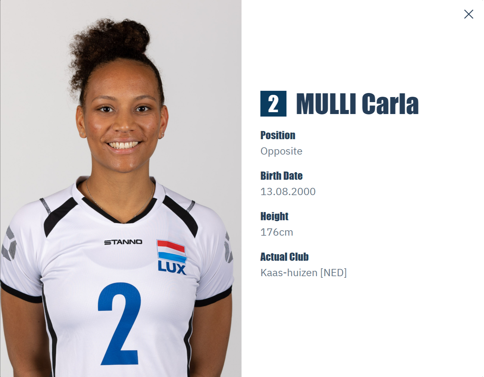
- Customer:
Fédération Luxembourgeoise de Volleyball
- Sub Title:
Beach Volleyball Jerseys
- Main Service:
GRAPHIC DESING
- Customer URL:
https://flvb.lu/beach
- Customer Logo:
- Involved:
- Name:
Marc , Function:
Project Lead , Portrait:
- Name:
Jakob , Function:
Designer , Portrait:
- Key Features:
- Title:
Design concept with a clear visual structure and color logic , Description:
The jerseys were created based on a well-thought-out layout grid, precisely aligning gradients, city silhouettes, and typography – as documented in the detailed production file. , Image:
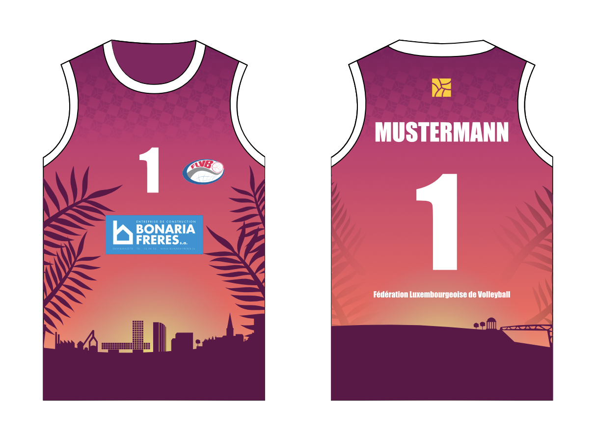
For the Lux Beach Tour 2024, Luxembourg’s national beach volleyball tour series, we designed the official jerseys for all tournament stops of the season. The goal was to visually capture the dynamics and atmosphere of the sport through a concept that is both functional and emotionally engaging.
The result is two distinct color variants, each symbolizing a unique moment on the beach:
- The blue variant represents the freshness and energy of sunrise, featuring a cool gradient with bright accents.
- The purple variant reflects the warmth and intensity of sunset, with stronger tones and a dynamic color flow.
The design is complemented by two individual city silhouettes, integrated into the jersey layout: Esch-sur-Alzette and Luxembourg City – depending on the tour stage, without overlapping visually. Both designs create a regional connection while reinforcing the visual identity of the tour series.
- GRAPHIC DESIGN:
Illustration, Conception, Ready-to-print files
- Customer:
Fédération Luxembourgeoise de Volleyball
- Sub Title:
Beach Volleyball Trikots
- Main Service:
GRAPHIC DESING
- Customer URL:
https://flvb.lu/beach
- Customer Logo:
- Involved:
- Name:
Marc , Function:
Project Lead , Portrait:
- Name:
Jakob , Function:
Designer , Portrait:
- Key Features:
- Title:
Designkonzept mat kloer visueller Struktur a Faarflogik , Description:
D’Trikoten goufen op Basis vun engem duerchduechten Layoutraster entworf, deen Faarfverläifer, Stadtsilhouetten an Typografie präzis openeen ofstëmmt – sichtbar och an der detailléierter Produktiounsdatei. , Image:
Fir d’Lux Beach Tour 2024, d’national Turnéesserie am Beachvolleyball zu Lëtzebuerg, hu mir den offiziellen Trikotdesign fir all Spillstatiounen vun der Saison entworf. D’Zil war et, d’Dynamik an d’Atmosphär vum Sport mat engem visuellen Konzept ze verbannen, dat souwuel funktionell wéi och emotional iwwerzeegt.
Entstanen sinn zwou faarflech ënnerschiddlech Trikotvarianten, déi jeeweils e spezielle Moment um Plage symboliséieren:
– Déi blo Variant steet fir d’Frëschheet an d’Energie vum Sonnenopgang, mat engem kille Faarfverlaf an hellen Akzenten.
– Déi violett Variant reflektéiert d’Wäermt an d’Intensitéit vun engem Sonnenënnergang um Plage, mat méi staarke Faarftéin an engem dynamesche Faarfspill.
Ergänzt gëtt den Design duerch zwou individuell Stad-Silhouetten, déi an d’Layout vun den Trikoten integréiert goufen: Esch-Uelzecht an Lëtzebuerg-Stad – jee no Etapp vun der Tour, ouni sech gestalteresch ze iwwerlappen. Béid Designen schafen esou e regionale Bezuch a stäerken gläichzäiteg déi visuell Identitéit vun der Turnéesserie.
- GRAPHIC DESIGN:
Logo Design, Branding
- Customer:
Sportlycée Luxembourg
- Sub Title:
Logo Design
- Main Service:
GRAPHIC DESING
- Customer URL:
https://portal.education.lu/sportlycee
- Customer Logo:

- Involved:
- Name:
Marc , Function:
Project Lead , Portrait:
- Name:
Jakob , Function:
Designer , Portrait:
- Key Features:
- Title:
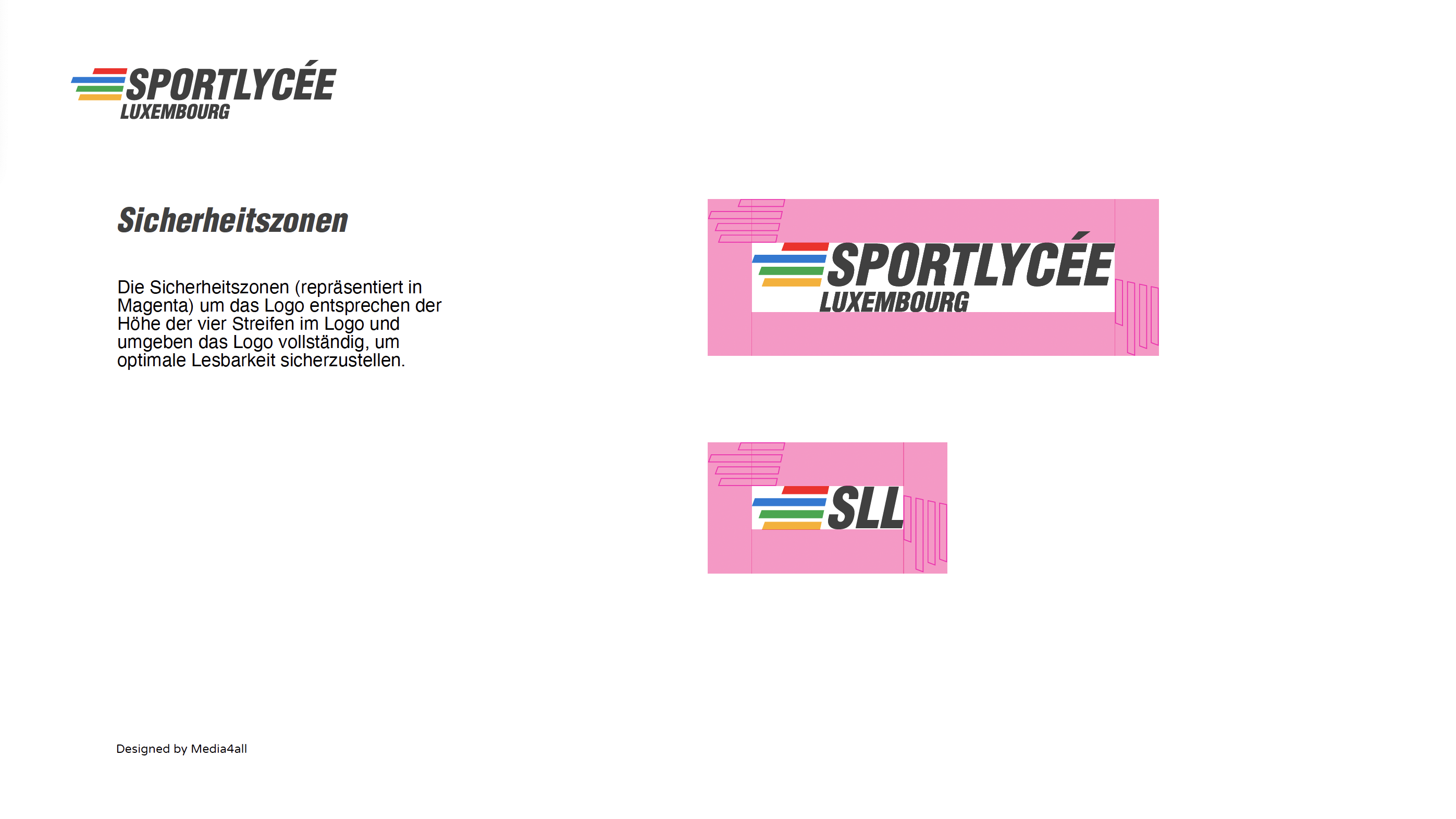
Styleguide , Description:
E kompakten Styleguide definéiert Faarfwerter, Typografie, Uwendungsvarianten an Sécherheetszonen vum Logo a garantéiert esou eng konsequent Markenuwendung iwwer all Medien ewech. , Image:
Fir d'Sportlycée Luxembourg hu mir op Basis vum bestehende Erscheinungsbild en modernes, dynamescht Logo-Redesign entwéckelt, dat de sportleche Charakter an d’Identitéit vun der Schoul zäitgeméiss interpretéiert a visuell schäerft.
Zentraalt Gestaltungselement vum neie Logo si véier stiliséiert Geschwindegkeetsstreifen, déi gläichzäiteg als symbolesch Duerstellung vun enger Aschelaafbunn mat véier Spueren interpretéiert kënne ginn. D’Streife sinn op der lénkser Säit vun der Wuertmark positionéiert a bilden zesumme mat hir e gläichgewiichtegt Logo, dat Konkurrenzgeescht, Virwäertsdrock a Vitesse visuell op de Punkt bréngt.
D’Faarfwelt vun de Streife orientéiert sech bewosst un den olympesche Faarwen, fir déi international Ausriichtung an den héije sportlechen Usproch vum Lycée z’ënnersträichen. D’Typografie vun der Wuertmark gouf duerch eng kloer, riichtlinneg Schrëft ersat, déi Dynamik a Zielstrebegkeet vermëttelt, ouni dobäi u Liesbarkeet oder Seriositéit ze verléieren.
D’neit Logo gouf an zwou Faarfvarianten entwéckelt – fir hell an däischter Hannergrënn – an an engem kompakten Styleguide dokumentéiert. Dëse Styleguide ëmfaasst d’Typografie, Faarfdefinitiounen, Uwendungsbeispiller souwéi déi néideg Sécherheetszonen, fir eng korrekt a konsequent Uwendung am Print- an Digitalberäich ze garantéieren.
- GRAPHIC DESIGN:
Logo Design, Branding
- Customer:
Sportlycée Luxembourg
- Sub Title:
Logo Design
- Main Service:
GRAPHIC DESING
- Customer URL:
https://portal.education.lu/sportlycee
- Customer Logo:
- Involved:
- Name:
Marc , Function:
Project Lead , Portrait:
- Name:
Jakob , Function:
Designer , Portrait:
- Key Features:
- Title:
Style Guide , Description:
A compact style guide defines color values, typography, usage variants, and safety zones for the logo, ensuring consistent brand application across all media. , Image:
For the Sportlycée Luxembourg, we developed a modern and dynamic logo redesign based on the school’s existing visual identity. The new logo offers a contemporary interpretation of the school’s sporting character and institutional identity, sharpening its visual presence.
The central design element of the logo consists of four stylized speed stripes, which can also be interpreted as a symbolic representation of a four-lane running track. Positioned to the left of the wordmark, the stripes form a balanced logo composition that visually conveys competitive spirit, forward momentum, and speed.
The color palette of the stripes is deliberately inspired by the Olympic colors, emphasizing the school’s international orientation and its high athletic standards. The typography of the wordmark was replaced with a clear, linear typeface that communicates dynamism and determination without compromising legibility or professionalism.
The new logo was developed in two color variants – for light and dark backgrounds – and documented in a compact style guide. This guide defines the typography, color specifications, usage examples, and safety zones, ensuring consistent application across print and digital media.